

Poetry Website – Case Study
Role: UI/UX Designer, Graphic Designer
Scope: Responsive Website Design, Branding, UX Structure, Layout Systems
Designed a responsive website that highlights the work of 50 well-known poets and invites community engagement through features for amateur poets to share, critique, and submit original poetry. The project aimed to create an inclusive, interactive poetry hub while balancing a visually distinctive aesthetic rooted in neon tones and Art Deco inspiration.
Key Contributions:
Developed a scalable layout system to support large amounts of editorial content
Created a full brand identity including logo, color palette, and typography
Built a responsive design across desktop, tablet, and mobile views
Focused on clarity in content hierarchy and intuitive user flow
Designed a “Community” section to foster user interaction and participation

This project began with a clear goal: make poetry feel vibrant and fun. I wanted to design a space that honored both famous and amateur poets while encouraging community engagement.
Research & Planning
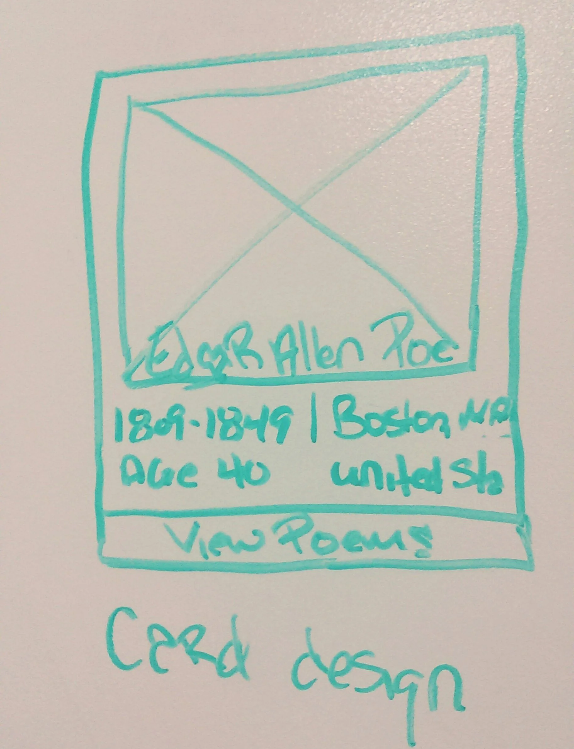
I started by mapping out the site structure to get a clear sense of scope and content organization. From there, I sketched wireframes on a whiteboard to explore layout ideas quickly and iteratively.


User Personas
To ground the design in real-world usage, I created detailed personas to represent the primary user types.
These personas helped shape decisions around content hierarchy, community features, and tone.


UX Development & Testing
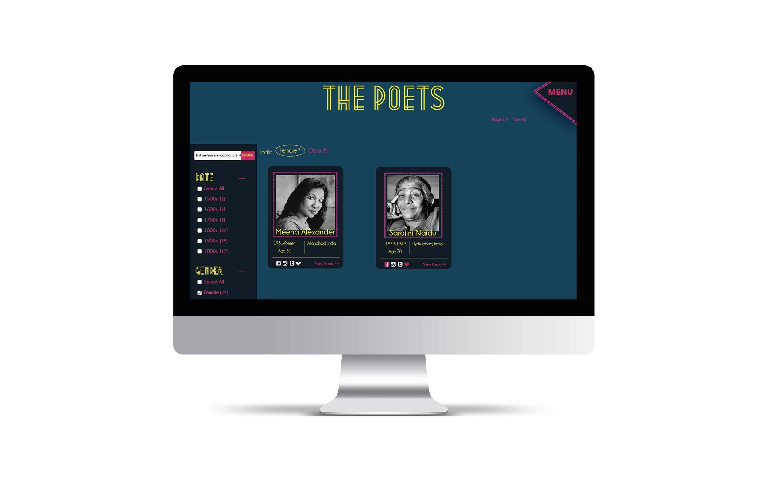
I built interactive wireframes in Axure and tested them with three users. Two navigated the site easily, while one less tech-savvy tester highlighted a confusing interaction. Based on that feedback, I refined the structure to improve clarity.


Visual Design & Branding
The visual direction was inspired by a photo of a neon sign against gray asphalt at a London bus stop. That image sparked an Art Deco-inspired aesthetic with a modern, energetic twist. The result is a colorful, responsive site that feels approachable and bold.


Key Features
A responsive design with scalable layout systems
A "Community" section for amateur poets to submit and critique work
Brand identity including logo, color palette, and typography
Visual hierarchy focused on content readability and intuitive flow
Designed for both mobile and desktop with accessibility in mind